Anna Sy Designs Serenity

April 24, 2004 | 12:00am
 We met architect Anna Sy 30 minutes before we actually saw her. We had just gone through killer rush-hour traffic and went into the restaurant she designed – Kail in Greenbelt 2 – well, actually we waited outside since it wasn’t open yet. At 10 in the morning when everybody was either late for work or already developing ulcers, we walked into a space that she would later describe as "like a jewelry box" – lined by ivory walls, seats of delicious suede and dramatically lit.
It was a paragon of calm and later she would ask us: "The world outside is already so chaotic, wouldn’t you want a space that’s calm and serene?"
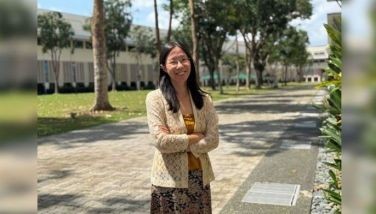
That’s our first impression of architect Anna Sy – not unlike the spaces she designs – calm, quiet, composed and in control.
So when we see the model unit she designed for Serendra in Fort Bonifacio, we are pleasantly surprised at the colors she used – not on the walls but in the artworks and several pieces of furniture. The same philosophy of home as a retreat, as a sanctuary is there, but this time, with touches of bold, retro colors.
Her design for Serendra is a refreshing take on a home with character, yet you also get the sense that it can be whatever the future homeowner wants it to be. It’s not designer stiff, it doesn’t give you the feeling that you can’t move the pieces around or else your interior designer would throw a bolt of lightning from the skies to teach you a lesson.
With the word "fun" being so overused, we’ll use the word "enjoyable" instead to describe the space. First of all, her unit’s floors are stained blue. Second, there is not a single piece of furniture that’s stained dark, which in the past five years seemed to be what people associate with the "designer look." I mean, even when reports from European trade shows declared for the past years that design is moving away from wenge and going back to color, Philippine furniture and interior design in general seem to be stuck with that look. It’s as if this was the only way to interpret Zen. Third, there is a hint of retro – and retro is always entertaining.
"Everyone’s used to seeing dark stain, so we decided to do something just completely opposite," she says. "I’m getting a bit tired of dark wood."
For this 190-square-meter mockup, managing director of C/S Design Consultancy Anna Sy wanted the look to be casual and informal, just to the left of white. Ordinary tangile plywood walls were bleached, which still reveals the grain of the wood and at the same time gives the feeling of lightness. At first we thought it was imported wood. Anna confides, "We wanted to use veeners, but we couldn’t afford it." And then there was the matter of a tight deadline. Her company had a month and a half to do the installation.
What kind of feedback has the space gotten? "Some people love it, some people hate it," she says frankly while giving us a tour of three-bedroom unit. "The people who love it are a little younger and more adventurous."
Ah, and those who don’t care much for blue-tinted floors? "Aesthetically, it’s something you don’t see every day." They don’t quite understand it – I’m not sure I do, too, but it does look enjoyable to dance on.
The casual concept called for an informal layout of the common rooms. In the living room, she put one big sofa in suede by Furnitalia, flanked by a modern interpretation of a caned recliner and cushions on the floor for people to sit on while watching TV or during a party.
"I didn’t feel that it was necessary to have furniture that really stood out. I was more interested in the total look rather than having an amazing piece here or there, I wanted it to just kind of blend together."
Right beside the living room is the dining room, which Anna furnished with a long table and green polypropylene chairs with steel legs. This very relaxed treatment continues on the wall where she hung abstract paintings that mimic the color of the chairs.
Standing in the middle of the room, we tell Anna that it almost feels like you’re in a beach house. She laughs and says, "The first time I saw the scale models of the development was during the launch. The whole idea for this complex is to have a lot of greenery outside. There’s something very bright about it. Even the colors of the buildings are light with splashes of green and yellow. We didn’t realize that the interiors we had done actually complement the exterior space."
Serendra takes its cue from the word "serene." A project of Ayala Land Inc. and Community Innovations Inc., the 12-hectare development is envisioned to be a low-density community with a cluster of low-rise buildings surrounded by open spaces that occupy as much as two-thirds of the lot. You don’t get that much open space with today’s development – especially in the Makati area! But Ayala Land executives reportedly visited developments in Europe and in the US to get a sense of what kind of community they wanted to grow in Serendra. And what they found was that low-density and big spaces went hand in hand in the best of these projects.
Ayala Land chose the architectural firm Moore Rubble Yudell (MRY), based in Santa Monica, California, whose portfolio includes successful international projects around the world. The multi-awarded firm was co-founded by the late Charles Moore, now widely regarded as one of fathers of post-modern architecture. They’ve worked on institutions, housing, research buildings, places of worship, and private residences from Berlin to Beijing, from Sweden to Japan, and now in Bonifacio Global City.
For the landscaping, they turned to Mia Lehrer who, according to Ayala Land, does thematic landscapes and her plan for Serendra’s landscape is to "echo the curvilinear forms of the buildings in the open spaces and infuse the gardens with charming twists."
Architect Andy Locsin was also recruited to "tie all the elements and influences into one visual whole and create an Asian and Filipino theme for the buildings."
Serendra will have a retail area, similar in treatment to what the Greenbelt development offers – open spaces interspersed with commercial stores.
Anna Sy takes us to the scale models and explains that the buildings offer different sizes of units. Some of them will have big ones, others small ones, yet you wouldn’t know it by looking at the buildings from the outside because they are designed in the same manner – units with terraces that look out to the landscaped areas or the retail part.
"The unit sizes are bigger than some of the other developments. For example, I live in a two-bedroom unit in Salcedo and definitely the living and dining area is a smaller than the one here."
One of the things we like about the unit she designed is the layout. The bare unit was typical of any condominium – a series of doors to the right where the bedrooms are all lined up. Anna designed the unit in such a way that the private spaces – the bedrooms, the family room – are separate from the space the homeowner would use for entertaining. Upon entering the foyer, there are two glass doors that lead to the dining room, living room and kitchen on the left, and the family room and the three bedrooms to the right.
The foyer actually gives you a sneak preview of the kind of art that decorates the unit. Anna chose abstract art by Lofranco, Joven Alcala and Blaine San Luis "for their calming and happy colors." In the bedrooms, the large paintings double as the headboards.
What’s the most common mistake that condo dwellers make when decorating their homes? "They put too many pieces of furniture in the rooms," says Anna. In the master bedroom, she answers both the space and aesthetic requirements by designing one continuous piece of bed frame and bedside tables in light-stained wood.
"I like very simple things. Again, the idea is to incorporate everything into one unit that takes care of the necessities, you don’t’ have lots of things all over the place."
The result is a very efficient space and streamlined look. Again, a sense of calm permeates the room with just the very sculptural Pantone chair and a blue armchair with ottoman in the corner as the pices. Even in the smaller guest rooms, there is a sense of breathing space and elbow room because Anna keeps them spare and contained.
AHarvard graduate, architect Anna Sy established C/S De-sign Consultancy with her design partner Jason Chai, who’s based in their Connecticut office. Anna goes to the US about four times a year to work with Jason on their projects there, and Jason to work on the projects here.
"When we start a project, we do it together. He’s just as instrumental, especially in the origins of the designs that we do. When I go to the US to collaborate with him, it’s also a good time for me to know what’s going on there, get a little bit of exposure."
From the time she came back to Manila in the mid-1990s, Anna has earned a reputation as an exceptional designer for modern projects.
Anna laughs and says, "Inherently, I’m a modernist. I get excited doing modern work but I am also happy doing fairly traditional work. For example, in Calatagan, we did a takeoff from a traditional Filipino house. I think the traditional Filipino architecture is very beautiful – the bahay na bato, the Vigan houses. Intramuros is a wonderful place, if only they could regenerate the life there and make it a very cohesive community."
Even when she was young, Anna had been exposed to different styles of architecture and cultures. Her father, banker Ramon Sy, led an expat life with his family. Anna has lived in places such as Tokyo ("I loved it so much I remember crying a lot when we were leaving"), Hong Kong, and the US.
For her, there is no such thing as a dream project. There is, however, a dream client, one that is so "open-minded and interested in experimenting and is adventurous with ideas."
Her favorite structure in the world was designed by Le Corbusier – the Convent of La Tourette near Lyon, France. "His work is very sculptural but very controlled. He’s one of the few architects that successfully translated his theories of architecture into design, which is very difficult to do. He did it so wonderfully, he was brilliant."
The most challenging and interesting work she has done? "We’ve done several interesting houses and we’ve been really lucky with our clients, In terms of the most challenging, it hasn’t happened yet. To me, the most exciting part of design is the beginning, the first time you actually get the concept working, and the end, when you see the concept in reality."
Architects and interior designers always say that doing a house is one of the hardest projects to do because it’s so personal. Homeowners say that during the course of the project, they get to know themselves better – what they want out of their homes and ther lives.
Is it also the same for architects? Do they discover something new about themselves when they’re building a house? "When you start out as an architect, if you have a certain design idea, you want the client to do exactly what you want and you get frustrated and can’t understand why the client likes something else. I think as you get older, you mellow and you learn to understand that there is a lot of compromise when it comes to design, especially designing someone else’s home because it’s such a personal thing to do. At the end of the day, you want the personality of the client to come out in the house. You’re not as dictatorial and you also learn to fight your battles, to pick and choose what’s very important to a you as a designer and what’s not so important that you just let it go."
With each project, Anna gets to know more what she wants for herself and what she doesn’t. One day, she says, when she’s going to build a house of her own, stylistically she wants it to be "relatively modern and relatively minimalist."
It’s going to be a small house in a big plot of land. It’s going to embrace the exterior space, it’s going to open to a garden or a forest or a view.
"I don’t want a big house, but a nice decent home but lots of land."
Nowhere would chaos be in sight. Just serenity.
BrandSpace Articles
<
>


